no. 1
no. 2
no. 3
no. 4
no. 5
no. 6
no. 7
no. 8
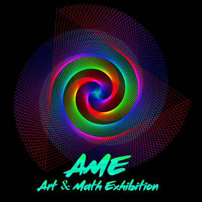
no. 9: this is the winning logo!
no. 10
no 11
no 12
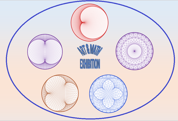
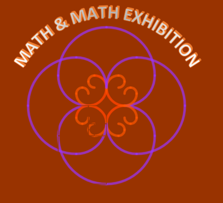
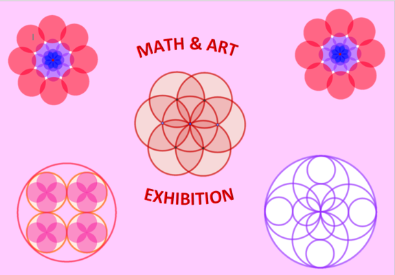
So many good proposals for a logo, created by Italien students (a whole class) are in a Geogebra Book.
no 13
no 14
no 15
no 16
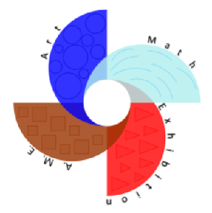
The author writes:"The logo is represented by a four petal fan that opens up on a circle. In a combination of elegance and simplicity, the petals represent the four elements of nature: red for the fire, blue for the water, brown for the earth, light blue for the air. The circle, on the other hand, is white and represents the purity, quality that should be in every human being".
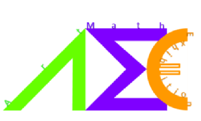
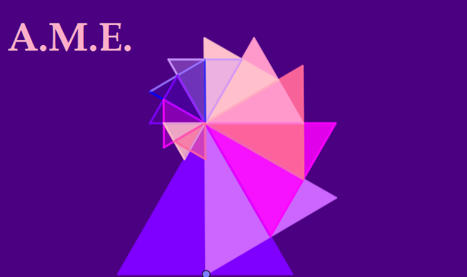
The author writes:"This logo is based on art and symbols. The right-angled triangle without the base represents geometry. The word "Art" is on the hypotenuse. The mathematical symbol sigma, coloured in purple, represents the letter "M" rotated 90 ° to the left. On the upper side is written "Math". The golden euro highlights the European project and along the internal semicircle is written "Exhibition". The colors, apart from the euro, which is typical of the symbol, were chosen for the greatest visual impact.All together in a stylized way it could represent a cosmopolitan futuristic city. There is an escalator that brings people up to the Skyscraper, where they work and live. Next to a clock, similar to the Big Ben they can enjoy their spear time. While the acronym A.M.E. represents the futuristic city, Art, Math& Exhibition are the stylized people".
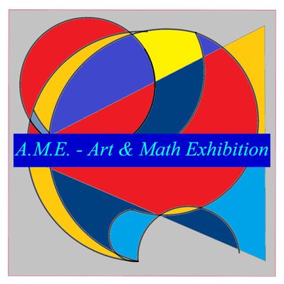
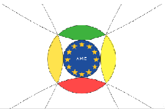
The author writes."I wanted to draw something simple that could easily be remembered by the viewer. I constructed two circles, a larger external one and a smaller internal one that contains the European Union flag and the name of the project. The larger circle is crossed by four ellipses. I wanted to colour the Logo with the three RGB colours: red, green and blue".
That is nice to have these explications. Thank you, Italien team!S. from Germany
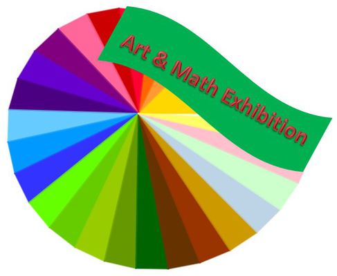
We loved to do spiral. The logo combines math (the construction of spirals and rotation) and art because this picture is very creative and nice. (I have translated what one of my students has told me, Monika Schwarze, teacher from PGU)
Very good! (E., student, PGU)
All very nice and meaningful logos. Difficult to decide!Norma Lisa
Beautiful works and amazing descriptions. I admire /POL/