This is the final infographic we asked our students to prepare to sum up their job.
They prepared it collaboratively using Canva.

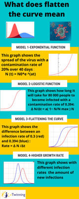
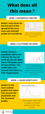
| Students from Team Germain created, with the help of the program Python, four models that represent the curve of the virus spreading. The first model shows us an exponential growth of the virus, made considering only infected people. The second model is similar to the first one, but it considers also that there is a limit of population, of people that could be infected. In the third model we had established two infection rates and saw the differences between them. The fourth model is the most realistic one because it takes into account the entire population and the recovered people. It shows the amount of new infections with different infection rates. | |