Activity for the schools, project partners
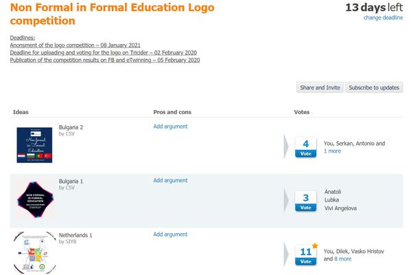
When you are ready with your logos go to Tricider and upload it there
Logo competition anonsment:
logo anonsment.pdf
Some ideas and tips
A good logo should:
- Be eye catching
- Be timeless
- Be memorable
- Work well large or small
- Encompass your brand vibe
How to create a brand logo: Getting started
Okay, so you know which “styles” of logo you have to choose from. Now, you just need to focus on making your logo as effective as possible. Although creating a brand logo is a subjective experience, the most effective marks need to be:
- Simple: Simple logos are easier to recognise and remember.
- Memorable: The best logos set your brand apart, and distinguish you as unique.
- Timeless: A logo needs to be able to evolve and adapt to the trends.
- Versatile: A logo should be available in a range of sizes, colours, and mediums.
- Appropriate: Great logos are appropriate for the brand’s intended audience.

Particular logo shapes send out particular messages:
- Circles, ovals and ellipses tend to project a positive emotional message. Using a circle in a logo can suggest community, friendship, love, relationships and unity. Rings have an implication of marriage and partnership, suggesting stability and endurance. Curves on any sort tend to be viewed as feminine in nature.
- Straight edged logo shapes such as squares and triangles suggest stability in more practical terms and can also be used to imply balance. Straight lines and precise logo shapes also impart strength, professionalism and efficiency. However, and particularly if they are combined with colours like blue and grey, they may also appear cold and uninviting. Subverting them with off-kilter positioning or more dynamic colours can counter this problem and conjure up something more interesting.
- It has also been suggested that triangles have a good association with power, science, religion and law. These tend to be viewed as masculine attributes, so it's no coincidence that triangles feature more prominently in the logos of companies whose products have a masculine bias.
- Our subconscious minds associate vertical lines with masculinity, strength and aggression, while horizontal lines suggest community, tranquillity and calm.
- The implications of shape also extend to the typeface chosen. Jagged, angular typefaces may appear as aggressive or dynamic; on the other hand, soft, rounded letters give a youthful appeal. Curved typefaces and cursive scripts tend to appeal more to women, while strong, bold lettering has a more masculine edge.