The choice for the project logo was made among the the first nine creations . Each country chosed the two or three best logos.
Then students of each country could vote for the 3 best logos (from the 9 ones), giving 3 points for the bet one, two points for the next one, ...
Logo numbers:
first row from left to right: no. 1, no. 2, no. 3, second row: no. 4, no. 5, no. 6, third row: no. 7, no. 8, no. 9.
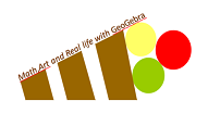
The winning logo is no. 1 created by Simone Bianco in Italy. Congratulations!
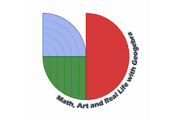
The circular shape is divided in three different parts, each of them filled with one of the RGB. Each part has a meaning: the circumference represents the terrestrial planisphere, the colours the universal Whole, the unequal parts the diversity of each individual, being alike as human beings. |
 |
 |
 |
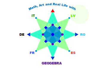
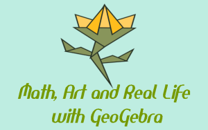
I thought of the Wind Rose. I used triangles and squares to construct the logo, using graceful colours of different nuances of blues and greens. The Wind Rose represents both the project and the twin spirit of the partners. |
 |
 |
 |
 |
There were much more wonderful logo creations from Italy and Romania.