Climate change is driven by an increase in global temperature. But how do we know global temperatures are on the rise?
At the following link in the Nasa Climate Change site
Graphing Earth temperature
we took advantage of a proposed classroom activity.
First of all, we watched this video:
Afterwards, students have been split into small groups.
They analyzed average temperatures measured on Earth for the past 136 years, but each group only be looked at a portion of that data.
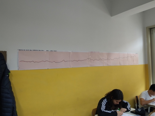
Each group is provided with the global temperature data and graph paper, and they will graph a subset of the points. Then, the class will combine all the graphs into one to represent the entire 136-year trend.
When individual graphs were complete, students had to determine if they saw an increase or decrease in mean global temperature for their group’s time frame. We discussed the risk of making climate assumptions and projections when looking at a small data set.
Students taped their graphs to classroom wall and lined them up horizontally, by year, maintaining equal spacing between all the years.
Students assessed the trend. Was there a trend of global temperature increase or decrease? The trend has always been the case over the past 136 years? If not, when did the trend shift?
Is there a way to predict global temperature means for the subsequent year?
Objectives of the activity and integration with the curriculum of Mathematics
- Stimulate student ability to use spreadsheet software to analyze data.
- Improve student ability to identify trends in graphically represented data.
- Stimulate student ability to associate human activity with global temperature trends.